
Typography Secrets That Make Your Brand Look Premium
12/01/2025
Word Count | Reading Time ⏱️: 1,087 words | 5 min read
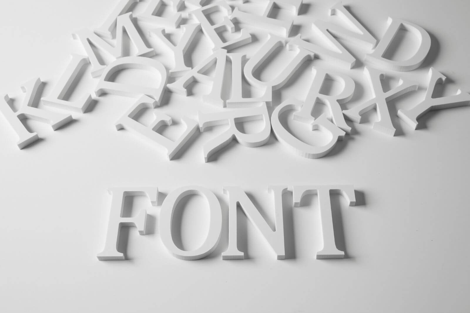
When it comes to branding, typography can quietly make or break your visual identity. Thoughtful graphic design & branding in Los Angeles, CA goes far beyond choosing a “nice-looking” font. The right typography builds trust, communicates personality, and instantly elevates how customers perceive your business.
If your brand feels flat, outdated, or inconsistent, your typography may be the missing piece.
Why Typography Matters More Than You Think
Typography is often the first design element people notice — even if they don’t realize it. Fonts influence emotion, authority, and perceived value.
Premium brands understand that typography:
- Creates instant credibility
- Reinforces brand personality
- Improves readability and user experience
- Sets the tone for marketing materials
- Differentiates you from competitors
In a competitive market like Torrance, strong graphic design & branding in Los Angeles, CA must feel cohesive across websites, packaging, social media, and print materials.
When typography is intentional, everything looks elevated.
What Fonts Make a Brand Look More Expensive?
One of the most common questions business owners ask is:
What fonts make a brand look more expensive?
Premium brands often use:
- High-quality serif fonts (elegant, refined, authoritative)
- Clean, modern sans-serif fonts (minimal, confident, contemporary)
- Custom or semi-custom type treatments
- Strong contrast between headline and body fonts
Luxury brands tend to avoid overused, decorative, or novelty fonts. Instead, they rely on restraint and clarity.
For example, pairing a sophisticated serif headline with a clean sans-serif body font instantly creates contrast and hierarchy. The key isn’t complexity — it’s intention.
Pro Tip: Use no more than two to three complementary typefaces in your brand system to maintain a polished, cohesive appearance.
The Power of Spacing and Hierarchy
Many brands focus on the font itself but overlook spacing — and spacing is where premium design truly lives.
Professional typography considers:
- Letter spacing (tracking)
- Line spacing (leading)
- Margins and white space
- Clear heading hierarchy
White space is not “empty space.” It signals confidence. Crowded layouts feel inexpensive. Clean layouts feel elevated.
If your website or marketing materials look busy, adjusting spacing may dramatically improve how your brand is perceived.
You can see how intentional design systems come together by reviewing professional brand work like the projects featured here:
How Do I Choose the Right Font for My Brand?
Another frequently asked question is:
How do I choose the right font for my brand?
Start with your brand personality. Ask yourself:
- Are we modern or traditional?
- Bold or understated?
- Playful or authoritative?
- Minimal or expressive?
Then ensure your typography aligns with your target audience. A law firm and a creative agency should not share the same typographic tone.
Professional graphic design & branding in Los Angeles, CA often begins with a brand discovery process. This ensures typography supports your mission, audience, and long-term goals — not just current trends.
If you’re unsure whether your current brand visuals reflect your business direction, it may be time to revisit your brand system entirely.
Learn more about structured brand packages here:
View branding packages and pricing.
Typography Consistency Across Platforms
Premium brands maintain typographic consistency everywhere:
- Website
- Social media
- Business cards
- Email signatures
- Packaging
- Advertising
Inconsistent fonts dilute credibility. When headings, subheadings, and body text follow a defined system, your brand appears established and trustworthy.
This is especially important for growing businesses in Los Angeles. As your marketing expands, your typography must scale with it.
A cohesive typographic system ensures that every new marketing piece feels like it belongs — even if it’s created months later.
Should Small Businesses Invest in Professional Typography?
Yes — especially if growth is the goal.
Is professional branding worth it for small businesses?
Absolutely. Strong typography:
- Helps you compete with larger companies
- Signals professionalism
- Builds long-term brand equity
- Increases perceived value
Customers often judge quality subconsciously. If your typography feels inconsistent or generic, your services may be perceived the same way.
Investing in strategic branding is not about aesthetics alone. It’s about positioning.
If you’re ready to refine your brand presence, start the conversation here:
Typography Trends vs. Timeless Design
Trends come and go — timeless typography endures.
While certain styles (ultra-condensed fonts, exaggerated serifs, handwritten scripts) may trend for a season, premium brands prioritize longevity. They choose type systems that will still feel relevant years from now.
Timeless typography focuses on:
- Clarity
- Legibility
- Balance
- Strategic contrast
- Simplicity
When done well, it rarely feels dated.
If you’d like to explore more branding insights, you can visit the main blog here:
Elevate Your Brand with Strategic Typography
At its core, typography is strategy disguised as style.
The right fonts — paired with thoughtful spacing and hierarchy — create a brand that feels intentional, confident, and premium. In a competitive market like Torrance, strong visual identity sets you apart before a single word is read.
If your brand feels “almost there” but not quite elevated, typography may be the upgrade you need.
Crastinum Creative specializes in graphic design & branding in Los Angeles, CA, helping businesses refine their visual presence and position themselves for growth.
Designing your tomorrow, today, right here in Los Angeles, CA.